Amid Ojubanire


Digipak Analysis
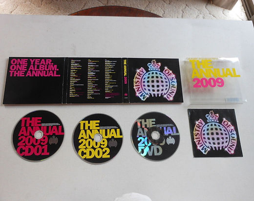
Here is my analysis of the minstry of sound digipack as we all know minsrt of sound are a leading dance and house music producers.
and from the looks of digipak its self you can defintly tell that it is a dance albumb as you can see the have used a black round so that the neon colours can stand out muck like the neon lights in a dark dance club. I feel they use this to represent the dance element of the genre.
I have chosen to analysis as good example of a digipack like this will give me an idea on what my own digipack could look like.


Sorry for Party Rocking
- LMFAO
Here is my analysis of the LMFAO 'sorry for part rocking' ablum for the looks of it what i can see is they went for the whole hardcore party vibe as for the use of the drunken facial expersion on the cover to suggest that they intoxiced with alochol like one would if they went to a party. Aslo the uses of the womens toned naked stomach being pressed against by both of the lmfao memebers suggest that they have some sex apple something one would aslo have during a party..
From anaylsis this DIGIPAK COVER what i get from this is that if we going to go down the house/dance music route i could add elemt of drugs such as alochol or sexual contitatision such as clevage or toned/ripped abs.
Smoke+Mirrors
- Imagine Dragons
Here is my analysis of the imaine dragons smoke+mirrors digikpak.from for first look what i dipict from the cover is that they have chosen to go for the artist paint look for there cover.with use of shades and rich colours it help give the whole image of the alumb a mystical and inchanted vibe. A vibe inwhichlinks to there album name smoke+mirrors.
From anaylsis this DIGIPAK COVER what i get from this is that if we going to go down the route of Alternative rock/indie rock vibe then painted artwork may be the way forward it could be f use in all sort of genres as so long as things can be drawn they be drawn to a spefic genre.